


Component Overview
Manage recurring layouts & content across your site - A complete overview of what components are used in this project including small hints on how to use them and how to avoid misuse.
Intro to Components
Components allow you to maintain a consistent, efficient, and scalable design workflow by creating customizable blocks from elements and child elements. Reuse those blocks across your site, and modify them in a single place to avoid individually revising each recurring layout.
Component Properties
Component properties let you define specific elements within a component that can be modified with unique values on a component instance.
This is great for recurring layout patterns whose structure should be uniform but have unique content in each instance. Or, you might want to slightly adjust the structure by hiding or showing specific elements in different component instances.
Component Types
CSS components
Those are marked with [CSS] - You don‘t have to make any changes on those. It is only important to place them into the page to get the design working. I will get into detail in a second.
Layout components
Those are marked with [CSS] - You don‘t have to make any changes on thThose are marked with [COMP] - Those are the ones you will be working with via copy and pasting them into the pages.ose. It is only important to place them into the page to get the design working. I will get into detail in a second.
Backup components
This is just for our internal use and are marked as [BACKUP]. Sometimes the layout of a section or element changed over time. With those backup components we wanted to make sure, to be able to have a fallback version of the old layout version. You dont have to work with those.
Component Usage
Adding a component to the page
If you want to add a component to the page you have 2 options to do so:
- press cmd+e to open the quick finder, enter the components name and click to insert into the page or
- in the left sidebar click the components panel, choose the component you want to add to the page and drag it into the pages body
- You can drag and drop it wherever you want
- See how it works:
Editing a component
Global Changes
If you want to edit a component, here is a quick walkthrough how to do so (we take the navigation bar as an example):
- double click into the component or click the pen icon that appears on the right hand side of the component so the editing modus opens
- you can start changing content
Properties
But what if you want to change something in a component and you dont want the changes to apply everywhere on the site?
We have a solution for that: Using a components properties.
In contrast to the step before, we are now able to change a components text, link etc. without the changes being applied globally.
- click on the component you want to edit properties on (it is important to not double click)
- on the right hand side you will see which properties of the component you are able to edit (in this case the CTA text and the CTA link)
- start changing content as desired
- lets take the frequently used mobile sticky CTA as an example
CSS Components
[CSS] Global Styles
Code Embed, that contains the projects custom styles (CSS). Please do not change anything here. If changes are requested, please reach out to us.
[CSS] Global Fluid Design
Code Embed, that contains the projects custom fluid design code, so the pages scale properly and fluid over all breakpoints. Please do not change anything here. If changes are requested, please reach out to us.
[CSS] DHP Form Styling
Code Embed, that contains the CSS for the DHP pages form stylings. If changes are requested, please reach out to us.
Layout Components
Components allow you to maintain a consistent, efficient, and scalable design workflow by creating customizable blocks from elements and child elements. Reuse those blocks across your site, and modify them in a single place to avoid individually revising each recurring layout.
Global Components
[COMP] Global - Navigation
Global navigation component. No component properties are set. That means changing the navigation components content will affect all pages (as the navigation component is nested in all pages). It's included at the top of this page.
[COMP] Global - Footer (practices included)
Global footer component including practice cms. No component properties are set. That means changing the footer components content will affect 98% of the pages.

[COMP] Global - Footer (practices excluded)
Global footer component without practice cms added. We needed that option as we reached the limit of 20 collection lists per page in some cases. No component properties are set. That means changing the footer components content will affect 2% of the pages. Specifically this component is used on the following pages:
- Services - Categories Template
- Für MDs und MFAs
- Standorte
[COMP] Global - Info Banner
This is the message that appears on all pages. It's included at the top of this page.
[COMP] Global - FAQ
This component was created as an example and starting point when adding FAQs to the page. As all pages have different FAQs you need to unlink the instance and change the filter for the page reference. New Questions and Answers will be shown automatically when added to the FAQ CMS beforehand.

Frequently asked questions

[COMP] App Download
This is a global component used to make it easier to change the app download links and images / QR code.


DHP Page Components
This component group contains all elements that can be used to create new DHP pages.
- [COMP] DHP Anfrage CTA
- [COMP] DHP Partner
- [COMP] DHP USPs
- [COMP] Leistungen avi Programme
- [COMP] Wer ist avi?
Section Components
This component group contains different sections used in the project. This group includes the following components:
- [COMP] Expat - Contact
- [COMP] Expat - Insurance
- [COMP] Expat - Promo
- [COMP] Section - Hausarzt online
- [COMP] Section - Locations Map (Tabs)
- [COMP] Section - LP Bullets
- [COMP] Section - Promo
- [COMP] Section - Purpose
- [COMP] Section - Reviews
- [COMP] Section - Services
- [COMP] Section - Practices Booking CTA
Slick Slider CSS
This is the CSS code to make the review slider appear correctly on all breakpoints.
<!-- [Slick Slider CSS] - JA - 13.06.2024 -->
<link rel="stylesheet" type="text/css" href="//cdn.jsdelivr.net/npm/slick-carousel@1.8.1/slick/slick.css"/>

<style>
/*Slick Slider Customizations*/

.slick-slider {
		position: static !important;
}

.slick-list {
		display: flex;
    overflow: hidden;
    width: 100%;
    position: static !important;
    padding-bottom: 5rem;
    padding-right: 7.5rem;
    padding-left: 7.5rem;
}

.slick-track {
		display: flex;
    position: static !important;
}

canvas {
  width: 100vw;
  height: auto;
  max-width: 100vw;
}

/*Slick Slider Customizations Large Screens (2000px)*/
@media screen and (min-width: 2000px){
 .slick-list {
   padding-left: calc((100% - 1660px) / 2);
 }
}

/*Slider Customizations - Mobile Devices*/
@media screen and (max-width: 1024px) and (min-width: 479px){
 .slick-list {
    padding-right: 2.5rem;
    padding-left: 2.5rem;
 }
}

@media screen and (max-width: 479px){
 .slick-list {
    padding-right: 2.5rem;
    padding-left: 2.5rem;
 }
}

</style>
<!-- [END Slick Slider CSS] - JA - 13.06.2024 -->
Slick Slider JS
This is the JS code to make the review slider work as expected and ensure all functionalities run smoothly.
<!-- [Slick Slider JS] - JA - 13.06.2024 -->
<script type="text/javascript" src="//cdn.jsdelivr.net/npm/slick-carousel@1.8.1/slick/slick.min.js"></script>

<script>
    $(document).ready(function() {

        $('#review-slider').slick({
            arrows: false,
            infinite: true,
            dots: false,
            autoplay: true,
            autoplaySpeed: 1800,
            speed: 600,
            slidesToShow: 3,
            slidesToScroll: 1,
            responsive: [{
                breakpoint: 1024,
                settings: {
                    slidesToShow: 3
                }
            },
            {
                breakpoint: 768,
                settings: {
                    slidesToShow: 3
                }
            },
            {
                breakpoint: 568,
                settings: {
                    slidesToShow: 1
                }
            }
            ]
        });


    });

</script>
<!-- [END Slick Slider JS] - JA - 13.06.2024 -->
Element Components
This component group contains different elements that were created as a component for a quick access. Those are:
[COMP] Back Button (JS)
This is created with a show javascript to be able to reach the previous page.
[COMP] Mobile Sticky CTA
This one was created to be able to have a mobile only sticky CTA and be able to adjust it‘s style globally. Text and link can be changed individually by adjusting its properties.
[COMP] DiGa USPs
The USP component was specifically created for the DiGa pages. Image and text can be easily adjusted via properties.


We have also created components for text and image elements to make the maintenance of the creation of practice landingpages easier. Those are:
- [COMP] Bus stop
- [COMP] Covid Text
- [COMP] Heading route
- [COMP] Hero Button
- [COMP] Hero Text
- [COMP] Important Info
- [COMP] Practice Adress
- [COMP] Practice Opening info
- [COMP] Route car info item
- [COMP] Route Info Heading
- [COMP] Route Info Text
- [COMP] Route Subheading
- [COMP] S-Bahn
- [COMP] U-Bahn
Health Blog Components
This is a quick walkthrough the info box component and how to use it in the health blog cms.

How to use the infobox component
- copy the html code below
<div class="info-box_blog">
<img src="https://cdn.prod.website-files.com/664c568a845fa3579e2156ba/67f620277db1a067d42d51e0_lightbulb.png" loading="lazy" alt="Glühbirnen Icon auf transparentem Hintergrund" class="image_lightbulb">
<div class="info-box-text">Lorem ipsum dolor sit amet, consectetur adipiscing elit. Suspendisse varius enim in eros elementum tristique. Duis cursus, mi quis viverra ornare, eros dolor interdum nulla, ut commodo diam libero vitae erat.</div>
</div>- open the health blog cms item where you want to add the infobox to
- scroll down to the "body text" cms field
- go to the area where you want to add your infobox to
- click the "+"

- choose "HTML embed"
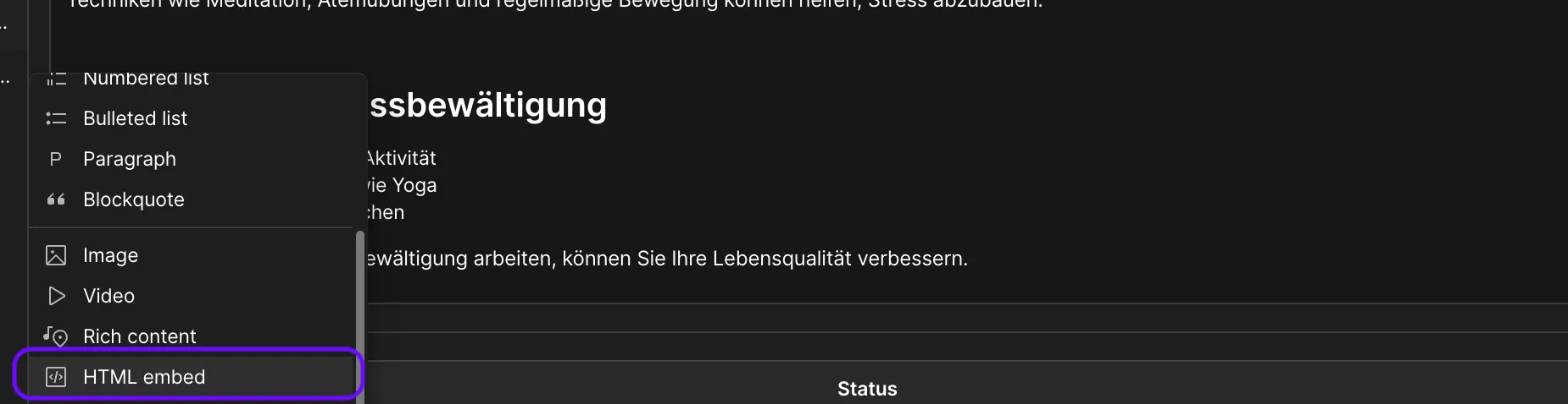
- paste the HTML code you copied from this page into the HTML embed
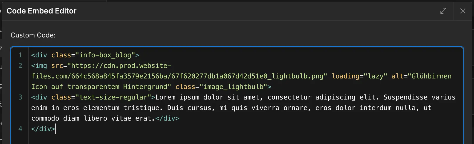
- change the lorem ipsum text from line 3 onwards to the text you want to show in the infobox
- do NOT delete the div tags by accident! Only change the text marked in blue on the screenshot below

- click save and close at the bottom right corner and republish you blog post item to make the changes appear in the live page
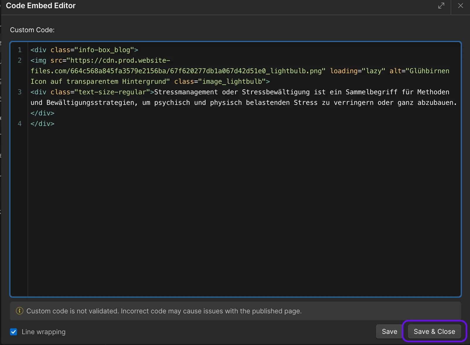
Done! 🎉
How to use the button component
- copy the html code below
<div class="button_blog">
<a href="/leistungen" class="button w-button">Termin buchen</a>
</div>- open the health blog cms item where you want to add the button to
- scroll down to the "body text" cms field
- go to the area where you want to add your infobox to
- click the "+" and follow same instructions as for the infobox
- change link and button text as you wish
- Note: Implement internal links like this: /leistungen and
- external links like that: https://app.avimedical.com/
Done! 🎉